01 the grommet
User Research | Prototype | Info Architecture | Interaction
What
A design challenge from The Grommet.com to improve the success conversion and better user experience.
Grommet is a unique e-commerce platform which provides a launchpad to under-represented makers and entrepreneur.
This is a low-fidelity prototype. As a part of The Grommet's hiring process, I went through this design challenge. There were set of objectives to focus and restriction.
Why
Objective was to improve over-all user experience by focusing on major key problems like :
-
Modernizing the website
-
Portray maker's-story and
product-details at once with equal importance -
Better utilization of white space
-
Along side having success conversion, tell the story of the maker
-
Improve the browsing experience
Specs
By
For
During
Using
Skills
Individuals
5 days
Axure RP 8 Pro
Ideation, Prototype, Wireframe, Information Architecture
HOW
Problem Description
This was a design exercise for The Grommet.com 's hiring process. Grommet is a unique e-commerce platform which provides a launch pad for underrepresented entrepreneurs (makers) for their products and a platform to sell their unique products online. As mentioned above under 'why' section task was to improve browsing experience of the website by telling maker's story as well having successful conversion rate. Modernize the website and improve the layout of information by avoiding a lot white space.
Process

understand
Information Gathering
Gathered insights from problem description provided by The Grommet about the challenge as well as stakeholder interview conducted with two persons from the business.
Done via :
-
Going through problem description
-
Maker’s story accessible and prevalent
-
Improve exploration and product purchase
-
Competitive analysis and UX modernization
-
Conversion – buying products
-
-
Stake holder interview ( Vanessa )

Competitive Analysis
l observed other competitors like Amazon, Macy and Walmart for their e-commerce solutions as well as entrepreneurship platforms like Kick-starter and touch of modern. My focus was to find existing solutions for the problems mentioned rather than re-inventing the wheel.
Other products considered :
-
Amazon
-
Kick Starter
-
Touch of Modern

User Interviews : Contextual Inquiry
Conducted 3 user interviews by giving them context of the website they were interacting with. I asked them to carry out set of tasks on the website via think aloud method. Also gathered open ended feedback about their experiences

Cognitive Walkthrough
I did a cognitive walkthrough of the platform mainly on user's journey to purchase a product. A figured out a a good number of opportunities and pain-points from the website.

Analysis
Triangulation
Triangulated the information that was gather from Interviews, competitive analysis and cognitive walkthrough. I was able to short list and collate the information into
-
Pain - points
-
Suggestions / Opportunities
-
Positives
-
Additional / Open ended feedback
Empathy Map
I created empathy map utilizing data and analysis to more clearly understand customers.

User Stories
As product of triangulation analysis I prepared set of user stories/goals, which I would use to measure success of the design later on.
-
As a user I want to pick a product from categorized list.
-
As a user I want to know maker’s value & story before making a purchase.
-
As a user I want to read product description to have clarity of product.
-
As a user I wish to see close-up look at the product for clarity.
-
As a user I wish to add multiple products from a maker “fav” list without interruption.
-
As a user I want to my website to retain my details if I navigate through various screens.
-
As a user I want to be able to have a quick view at my cart while shopping other products.
-
As a user I want to a pleasing & easy-to-use website to make purchases.
User Personas
Based on the research, I figured 3 group of customers, which would help me focus on their needs, goals and frustration while design the solution. Personas capture customer's demographics, main traits, goals, frustrations, back-story, personality traits and familiarity with technology, internet and social media.

Ideation
Crazy 8/2
To push myself to generate as many ideas as I can in short amount of time I went for Crazy 8s method. I did actually sketch out 5 possible variants of layouts that would solve the problem.
-
Pain - points
-
Suggestions / Opportunities
-
Positives
-
Additional / Open ended feedback
Wireframes
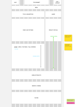
Digitized above mentioned 5 layouts using Axure, quick and dirty wireframes are easy to create and check for its fitness for the solution and get feedback on.
 Layout 1Layout 1 |  layout__2 |
|---|---|
 layout__3 |  layout__4 |
 layout__5 |
Design
Mid-Fi Prototype
For the sake of design challenge and time-criticality I picked the best design out of those 5 wireframes and picked best working features from each to create a medium fidelity prototype. Medium Fidelity prototype is clickable and black and white to give customers sense of the product and the interaction without letting them distracted with aesthetics ( colors and other details.
Takeaways
Learnings
-
Learned On-boarding : efforts that go into on-boarding a new-hire.
-
User Success Conversion matrix.
-
e-Commerce fundamentals
Challenges
-
Time constraint : 5 days.
